Shipping The Economist's first AI products
In 2024, I joined The Economist as AI Product Design Lead to launch their first AI-powered products: semantic search to replace Google's deprecated service, article summaries and the infrastructure for future AI capabilities. All while maintaining The Economist's core engagement metrics and reader trust.
Design process overview
Research: User research with 60+ readers, editorial team interviews, competitor analysis of AI-powered media products
Iteration: 8 rounds of prompt refinement with editorial scoring, 3 major interface design revisions based on usability testing
Evaluation: Systematic external testing via Applause, internal scoring with the editorial team, production monitoring (error rates, abandonment)
Collaboration: Cross-functional partnership with NLP engineers, editorial leadership, platform teams (web/iOS/Android), external AI partners (DeepSet AI)

Semantic search
The brief: Replace Google's Programmable Search Engine across all platforms while maintaining or improving the reader experience.
The aim was to enable search by theme or question rather than just keywords. This required results that understood "trade tensions" and "climate policy" as concepts, not merely strings of letters. The engineering team evaluated three backend options: Google Vertex AI, an Amazon Bedrock solution or a custom in-house build. In parallel, I designed a front-end experience that could support whichever backend the business ultimately selected. This approach allowed the team to test various options without blocking product development and gave leadership the time necessary to compare costs and capabilities.
To introduce visitors to the new capability, I refined the styling and copy of the search input UI. Collaborating with our Lead Content Designer, I tested several iterations of placeholder text before we landed on "Search or ask a question". This shift was essential for signalling that the interface now supported natural language and complex queries.

The search result teaser
I developed a flexible "teaser" component to act as the primary interface for each search result. This component comprised a headline, an image and relevant information about the content. Because The Economist organises its articles by editorial desks, I introduced labels to provide context beyond the basics. At a glance, visitors can see which desk produced each piece and identify its format, whether text, audio or video.
To further enhance the experience, I designed and tested various combinations of metadata (such as publication date and media duration) and retrieved RAG chunks within the teaser. My goal was to evaluate whether a traditional snippet, the article lede or a RAG-driven summary provided the most utility for visitors in a 'discovery' mode.
The final teaser adapts based on screen size to prevent information overwhelm. By dynamically adjusting the snippet length and metadata density, I ensured that the number of visible results remained optimal across devices without sacrificing the context needed for a relevant search. To achieve this, I collaborated closely with both Web and Apps engineering teams. This partnership ensured the design handled unique differences in the platforms and was published to their respective design systems.
The approach to page loading and pagination also differed between platforms. The app utilised a native spinner and "load more" behaviour to manage latency, while the web version retained traditional clickable pagination.

What we learned from search
Following a strategic evaluation, the product team opted to build the solution in-house. Upon release, core engagement metrics (including search journeys, click-through rates and time on page) remained stable. This consistency served as a positive indicator that the migration to an in-house AI backend did not disrupt the established reader experience.
The project also highlighted the requirement for iterative refinement. We found that further fine-tuning was required to enhance relevance for frequently covered topics, ensuring the system could accurately distinguish between large volumes of similar content to surface the most pertinent articles. Read more about our approach to evaluation and testing
AI transparency and interface design
We have also been busy exploring how AI will change The Economist. We now have a senior editor for AI initiatives and are busy experimenting with everything from translation to summaries. Rest assured that what you read, see and hear is journalism produced by a human (unless we have clearly stated otherwise).
— Zanny Minton Beddoes, Editor-in-chief, The Economist Group annual report and accounts 2024
Where should AI appear? How should it be styled to distinguish it from human journalism?
While early Generative AI proposals suggested placing summaries at the top of each article, user research revealed mixed feelings about the use of AI. Some welcomed AI features. Others raised concerns. This research, paired with the editorial mandate for transparency, shaped every subsequent design decision. To cater for both groups, I ensured that AI features were clearly labelled and strategically placed so as not to compete with the primary journalism for attention. The goal was to provide utility without compromising the brand's editorial integrity.

From MVP to editorial sign-off
For beta testing on web, the initial design remained faithful to the original concept sketches. The priority was speed to allow the team to gather user feedback as quickly as possible.
The Minimum Viable Product (MVP):
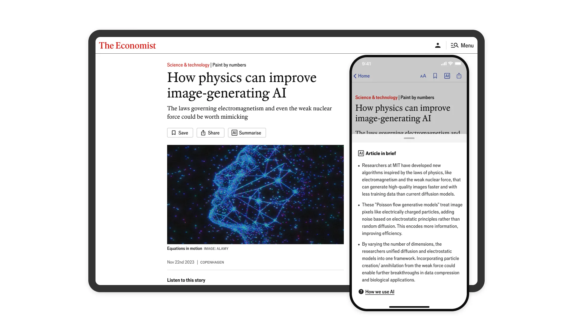
- Execution: I implemented an accordion component titled "Article in brief" that featured a clear "AI summarised" label.
- Default state: The accordion was closed by default to ensure it remained unobtrusive for readers wanting a traditional editorial experience.
- Placement: The component sat between the article media and the body text to capture attention without breaking the narrative flow.
- Visual signalling: The yellow label provided a high-contrast cue that the content was machine-generated.
- Typography: The switch to a sans-serif font served as a subtle but effective secondary marker of the content's non-journalistic origin.
- Interaction: A standard "Show" and "Hide" toggle with a chevron provided a familiar web pattern for users.
A beta test was launched for a B2B user segment on selected AI-related articles. At that point, there was a manual workflow for the creation, checking and editing of each summary. This meant there was a significant delay between an article being published and the summary appearing.
The test provided styling and performance signals to help develop the technical and design brief for the next iteration, but could not measure engagement impact given the audience size and content volume. We would need to proceed with caution. When the Product Team requested that the summary be displayed by default to maximise feature engagement, I identified a potential risk to the brand and the primary reading experience. The summary would push the article's opening paragraph below the fold, regardless of whether the visitor wanted to interact with AI. Prioritising AI summaries over journalism would send the wrong message for a news organisation.
To steer the design execution, visual hierarchy, copy and interaction patterns, I turned to qualitative research methods to gather evidence. I facilitated stakeholder workshops, ran usability testing and conducted competitor analysis. The insights gathered helped establish design principles that spoke to stakeholder and reader confidence levels and the upcoming product roadmap.
In addition to the requested default open accordion, I proposed a new recommendation based on this research.
- Put journalism first: The main image, standfirst and opening paragraph stayed above the fold. Readers saw editorial content before AI.
- Prominent and easy-to-access: I added the "summarise" action alongside existing actions like save and share. This positioned AI as utility, not content.
- Match each platform: On web, the button sat in the article meta bar. On mobile apps, it was added to the sticky Top Nav bar. Readers could access it without scrolling back up.
- Let readers choose: Visitors who want summaries can access them easily, whilst those who do not are not forced to engage with generative content.
When I was asked to present the designs in a sign-off meeting with the Editor-in-Chief, both the default-open route and the existing AI labelling were rejected. They were too dominant and repetitive. Fortunately, I also had my recommendation available. It spoke directly to her concerns, and she approved it for production.
Rollout across web and app was smooth. I was aligned with design and engineering leads and had been gathering feedback from the very beginning of the exploration.
A scalable AI labelling system
The existing AI label often wrapped awkwardly on smaller devices and did not translate well to the app interface. The ubiquitous AI sparkle icons and "AI-powered" labels didn't fit The Economist's analytical tone. This was a tool, not magic.
I developed an AI labelling system that could adapt across contexts. It could be displayed icon-only or paired with verb-based microcopy. AI "summarised." AI "translated." We describe the role of AI, not the technology. This gave us a consistent transparency marker that scaled as more features shipped.

Making AI sound like The Economist
The interface and labelling were important to Editorial, but their main concern was the content generated. Were summaries accurate? Did they sound like The Economist? Could they maintain the nuance of complex storytelling and analysis?
I worked with Editorial, NLP engineers and full-stack engineers to develop an evaluation framework, prompts and workflows that integrated into the existing publishing process.
"Writing with Style" is The Economist's editorial style guide. 200+ pages covering voice, tone and conventions, with rationale and the evolution of the language used. Simply uploading the PDF into the system prompt's context window wasn't enough to reliably achieve The Economist's quality and voice when summarising articles.
I extracted the rules and examples from the style guide, paired with published article chunks, to create few-shot system prompts. Using Deepset AI's prompt builder, routing and YAML, I could ground summaries with the target article and related content.
Representative summary prompt configuration showing style grounding, few-shot examples and output guardrails
Here are some examples of Economist-style explainers. Carefully analyse the structure, tone, and detail level of each explainer.

# Few-Shot Examples

{% for example in few_shot_examples %}
Example Document {{ loop.index + 1 }}:
{{ example.original }}

The other documents provided are a sample of previous Economist articles. Use these to inform your summarisation and match the writing style accordingly.
Evaluation and editorial workflows
The prompt configuration was only part of the challenge. Editors were our human in the loop. We needed workflows that felt intuitive, reliable and scalable. We replaced manual steps with an integrated flow in their existing tools. Instead of copying source articles and outputs between systems, editors could generate and edit summaries directly within the CMS.
We used prompt-level guardrails to catch violations before they reached editors, with banned words or phrases triggering automatic regeneration.
For evaluation, we used a three-tier approach. External testing via Applause provided systematic scoring from users outside the organisation. Internal testing with the Editorial team validated accuracy, tone and nuance against house style. Production human-in-the-loop gave us ongoing signals as editors generated and edited summaries in the CMS.
What shipped
Semantic search launched on web in November 2024 and app in January 2025. Article summaries were live in Q3 2025.
Core engagement metrics held steady. Article opens, read depth and referrals showed no negative impact from AI integration. The editorial acceptance rate (90%) and user feedback (87% positive) validated the summary prompt work and execution.
While these were the first user-facing AI features, the infrastructure now supports future capabilities and personalised experiences.